Signs and Symbols
A gallery of designs which rely on prints ability to go big.
Nine Eleven##
 World Trade Center
This was an icon for a campaign by the MCC Washington Office to commemorate the five-year anniversary of the destruction of the World Trade Center in New York.
Perdita
Perdita
When the Perdita Project, a guide to over 400 handwritten manuscripts compiled by women in the sixteenth and seventeenth centuries needed a logo using handwriting from the period as the basis seemed logical.
Relief
![]()
How do you describe “relief”? Helping people physically recover from some form of physical catastrophe. The icon is blue was chosen.
Water
![]()
What best describes access to water and access to food? This was what I was thinking about on this page of drawings.
Thrift
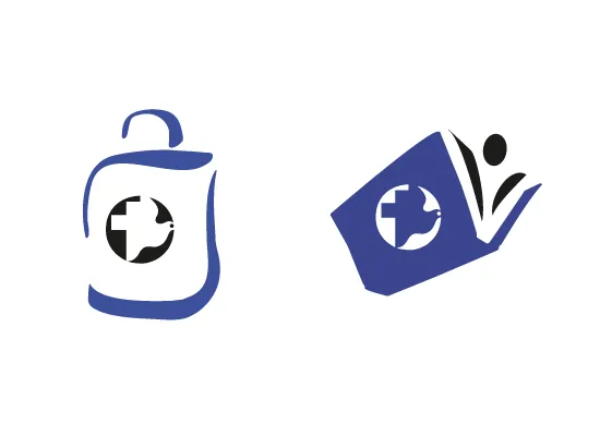
The thrift and used book shops who raise money for the work of MCC needed a logo. It was important to emphasize the link between MCC and the act of shopping. Surrounding the MCC logo with a book or a bag seemed to be what was needed. Sign makers and shop owners desperately wanted to put the logo in the centre of the bag shape but that just wouldn’t be right. When another designer was given the task of refreshing the brand system, the logo ended up in the middle of the bag, they all breathed a sigh of collective relief.
Way Finding
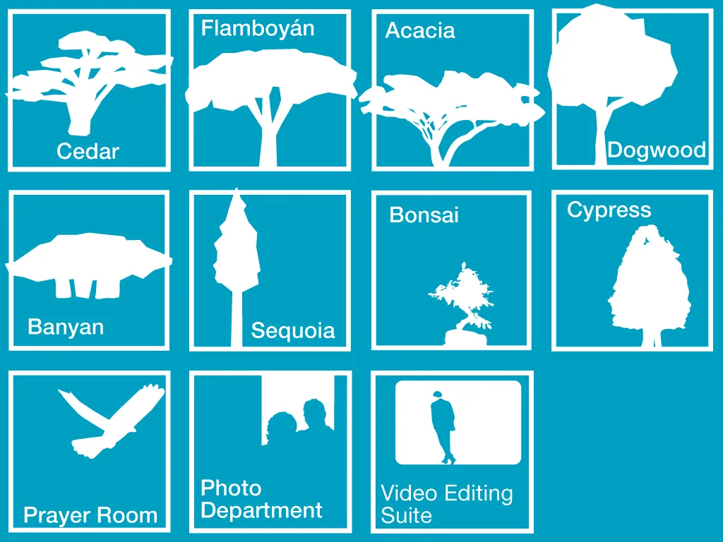
Gifted with the responsibility of designing a wayfinding system where most of the meeting rooms were given the name of a tree, I decided to add pictograms to make rooms more memorable. Some of the rooms weren’t “trees,” and required different images, so much for symmetry … .
Light bulb
In a previous life in the UK, my freelance graphic design business was fronted by a logo of a light bulb.